
Can the market darlings meet the growth priced into them?
11 June 2014 | Investments | General | Victor von Reiche, Cannon Asset Managers
Victor von Reiche, Senior Investment Analyst at Cannon Asset Managers, looks at the chances of the JSE high fliers actually delivering on expectations.
Cannon Asset Managers has long contended that, while the local equity market is on the expensive side, the pricing dispersions between attractively-priced shares and expensive sectors are at all-time highs. In other words, certain parts of the market have become outrageously expensive (and thus represent risk to investors) while other segments represent excellent investment opportunity.
The expensive part of the market is typically made up of large industrial shares, and their price performance has been dragging the index up over the last few years. The justification for their high prices (to our mind, a "bubble”), is that "this time it’s different” and the future is so bright for these loved "sexy” companies that it doesn’t really matter what price you pay for them.
Hence we decided to reverse engineer what their current multiples are inferring about the future, rather than look at what analysts are actually forecasting for these shares.
Simply put, we asked: what does the current price earnings (PE) ratio tell us about what the market believes future earnings growth will be? If that growth number is achieved, current investors will break even; if exceeded, investors will make a profit on the investment, and if not achieved, they will lose money.
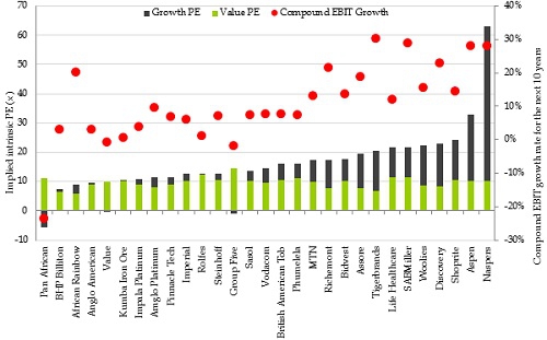
Figure 1: Inferred 10-year growth rates in the market
Source: Cannon Asset Managers (2014), Bloomberg data
The results are quite astounding and are shown in Figure 1 for a number of stocks across various segments of the market. The PE ratio – the total height of the bar – is shown on the left axis, while the ten-year inferred growth rate – the red dot – is shown on the right axis.
The green component of each bar represents the value derived from investments the company has already made and from which it is earning a return ("value PE”), while the grey component represents value added by investments and returns that must still be made ("growth PE”).
Using Naspers as an example, one can clearly see that most of the value attributed to Naspers by investors stems from growth investments the company must still make over the next decade (around 80% of the total valuation). We believe that it is prudent for investors to buy businesses where most of the value is explained by cash flows from existing assets (investments already made). Such companies reside mostly on the left hand side of the chart.
The high multiples of many larger industrial shares show that the market expects them to grow operating income by between 10% and 30% per annum for the next 10 years (circled in red), and that is just for current investors to break even!
These numbers don’t sound like much until you take into account the impact of compounding. Investors in shares like Aspen, Naspers and SABMiller will need their operating incomes to be around 10 times their current size in 10 years’ time to break even. Richemont needs it to be 6 times its current level in ten years. Shoprite, Woolies and Life Healthcare’s operating income has to be up 2.6 times over this period. These are, no doubt, great businesses but we believe market expectations of them are simply too high, especially considering that they are already large, and now need to get much, much bigger.
There are, however, many shares in the market where the "red dots” are low, zero or even negative. The market is inferring they will not grow, or only marginally grow their earnings over the next 10 years. This is where we believe the best investment opportunity lies. These shares only have to outperform these low or no growth expectations marginally, and investors will profit handsomely.
While it is possible that one or two of the "sexy” stocks may achieve their inferred 10 years’ growth, history is strongly against them. Of interest, we applied the same methodology to Microsoft in 1999, when it was on a 58x PE multiple and the company was unassailable (sound familiar?). The then 10-year inferred growth rate was 27.8% per annum, and Microsoft did actually manage to deliver a very respectable average operating income growth rate of 9% per annum over the next 10 years. And the share price? It fell from $60 to $30 over this period!
So how consistently do companies in South Africa typically grow their earnings? Figure 2 below shows various discreet periods starting in 1997, and on average, less than 5% of companies have shown the ability to grow earnings ahead of inflation every year for any 10 year period.
Figure 2: Companies’ ability to grow earnings consistently is very low
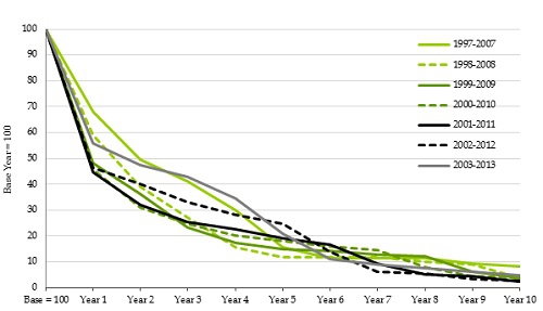
Source: Cannon Asset Managers (2014) proprietary data archive; Rita McGrath (2012) How the Growth Outliers Do It, Harvard Business Review
This "fade rate” starts relatively swiftly too. Less than 20% of companies have shown the ability to grow earnings ahead of inflation every year for five years. While we accept that this analysis is rather punitive in that it knocks a company out if there is just one year where earnings do not grow ahead of inflation, the point is that extended periods of earnings growth are very difficult to maintain. This further underscores how hard it is to achieve the high growth rates circled in Figure 1.
Managers that have had exposure to these expensive stocks will have done well in the recent past, and conversely, managers that have focused in areas of the market that are on attractive multiples will have done poorly. As the market realizes that these expensive popular stocks cannot deliver on their growth expectations, these shares will be penalized. We believe that prudent investors should start tilting their portfolios in favour of asset managers that are not exposed to these types of shares.
